Most lists of Facebook ad examples are screenshots of famous brands with famous budgets.

These are different. Every ad below is one I made for a brand I've worked with, from luggage to skincare to legal software.

I've grouped them by format and written a line or two on what each one is doing. Steal the format, not the ad.

The short version

A good Facebook ad does one job in one look: it stops the scroll, makes one point, and gives the viewer a reason to care.

Stop the thumb + one clear point + proof = an ad worth testing

Almost every example below uses one of eight formats. None of them is new. What makes them work is the angle underneath, chosen for a specific person. That part is creative strategy.

1. Borrowed formats

Dress the ad as something people already trust reading. The brain takes in the format before it notices the ad.
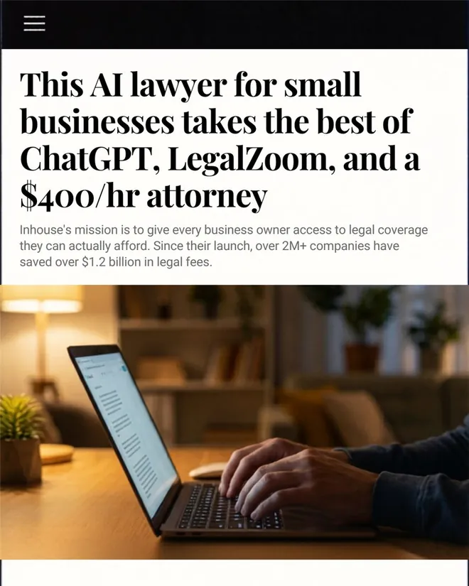
Inhouse AI ad styled as a news article about an AI lawyer for small businesses
Inhouse AI. Dressed as a news story, so it reads as information before it reads as an ad. The headline lines the product up against three options the reader already knows.
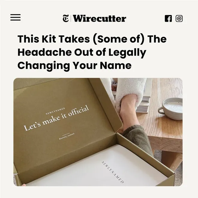
NewlyNamed ad styled as a review site article about a name change kit
NewlyNamed. Styled like a product review. Admitting the kit only takes away "some of" the headache sounds like an honest reviewer, which is what makes it believable.

2. Comparisons

A choice is easier than a decision. Put the old way next to the new one and let the viewer pick.
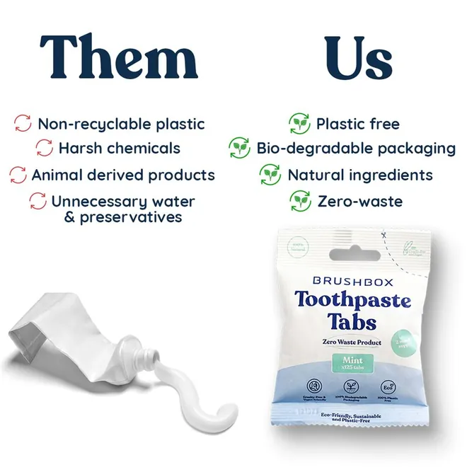
Brushbox ad comparing toothpaste in a tube with toothpaste tabs, them versus us
Brushbox. Them vs us, four lines each. The old way isn't described. It's lying on the left, squeezed out of its tube.
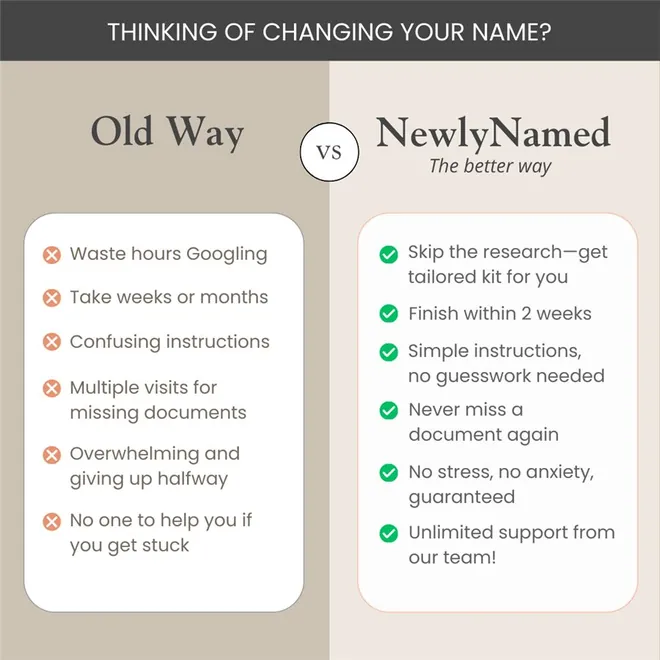
NewlyNamed ad comparing the old way and the NewlyNamed way to change your name
NewlyNamed. Opens with the question the viewer is already asking, then turns six frustrations into six fixes.
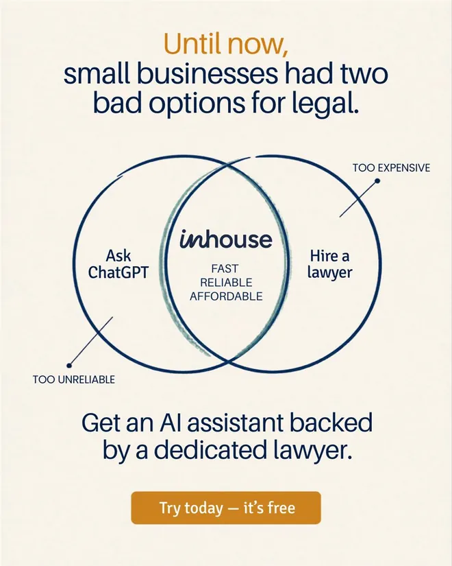
Inhouse AI ad with a Venn diagram between asking ChatGPT and hiring a lawyer
Inhouse AI. A Venn diagram makes the positioning visible: too unreliable on one side, too expensive on the other, the product in the overlap.
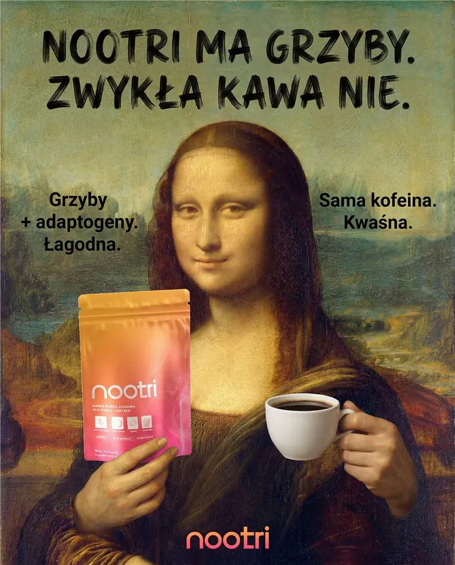
Nootri ad in Polish of the Mona Lisa holding the mushroom coffee pack and a cup of regular coffee
Nootri. For a Polish coffee brand: the Mona Lisa holding the product in one hand and regular coffee in the other. The headline says, roughly, "Nootri has mushrooms. Regular coffee doesn't."

3. The specific number

Specific reads as true. Adjectives read as advertising.
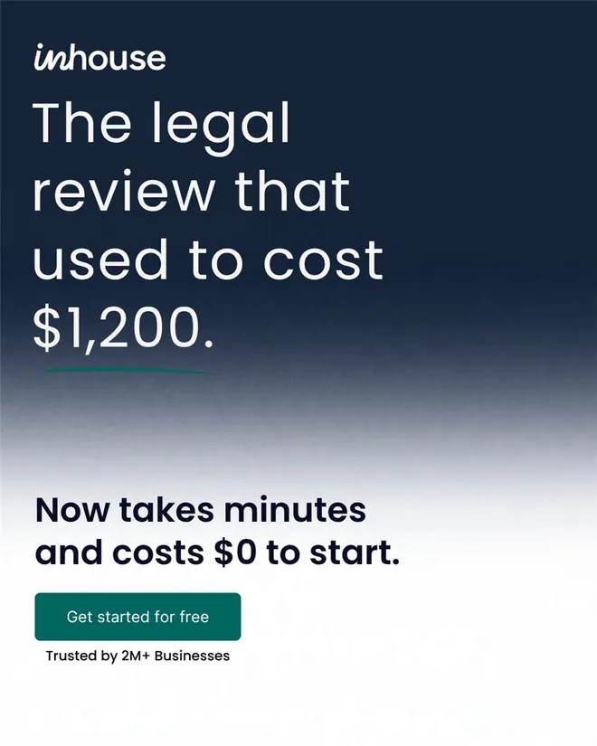
Inhouse AI ad: the legal review that used to cost $1,200 now costs $0 to start
Inhouse AI. One number does the whole job. $1,200 down to $0 to start is a before and after with no pictures.
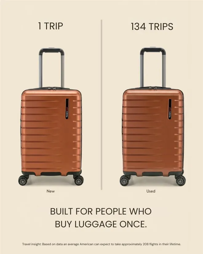
Traveler's Choice ad showing a new suitcase next to one that has done 134 trips
Traveler's Choice. One suitcase is new, the other has done 134 trips. The proof is that you can barely tell which is which.
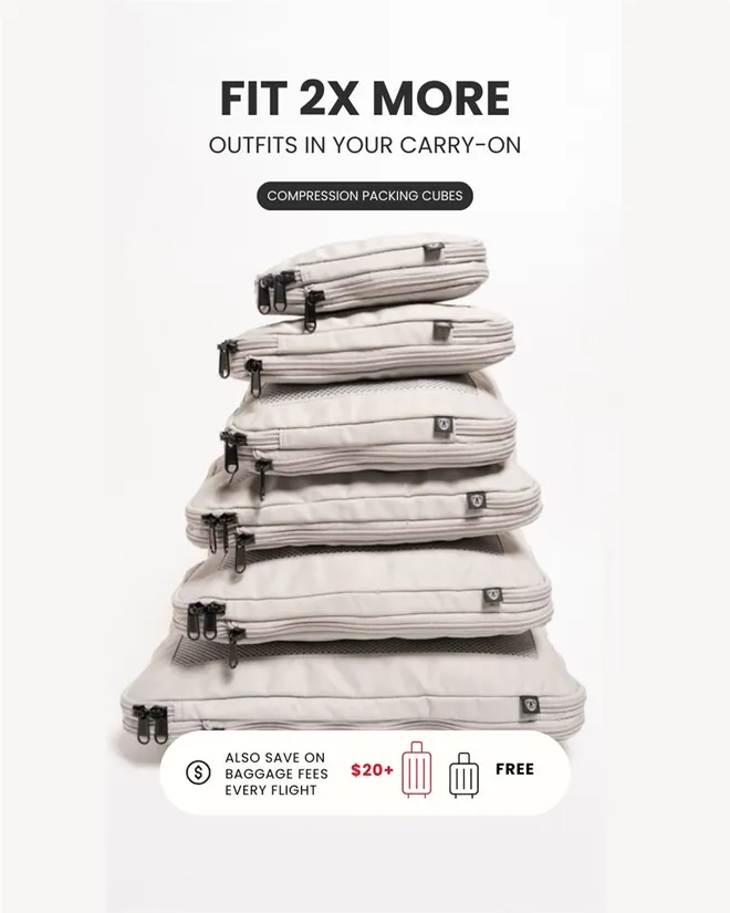
Traveler's Choice ad with a tall stack of compression packing cubes: fit 2x more outfits
Traveler's Choice. A tall stack of packed cubes turns "2x more" into something you can see. The baggage fee line adds a money reason.

4. Customer proof

What a customer says beats anything the brand says. Make their words the biggest thing on the ad.
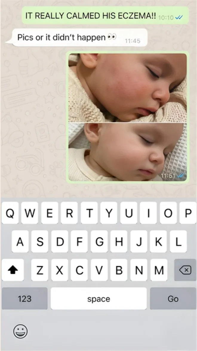
Sunborn Organics ad styled as a text message thread about a baby's eczema, with before and after photos
Sunborn Organics. A text thread between two people, with before and after photos. It looks like something a friend forwarded.
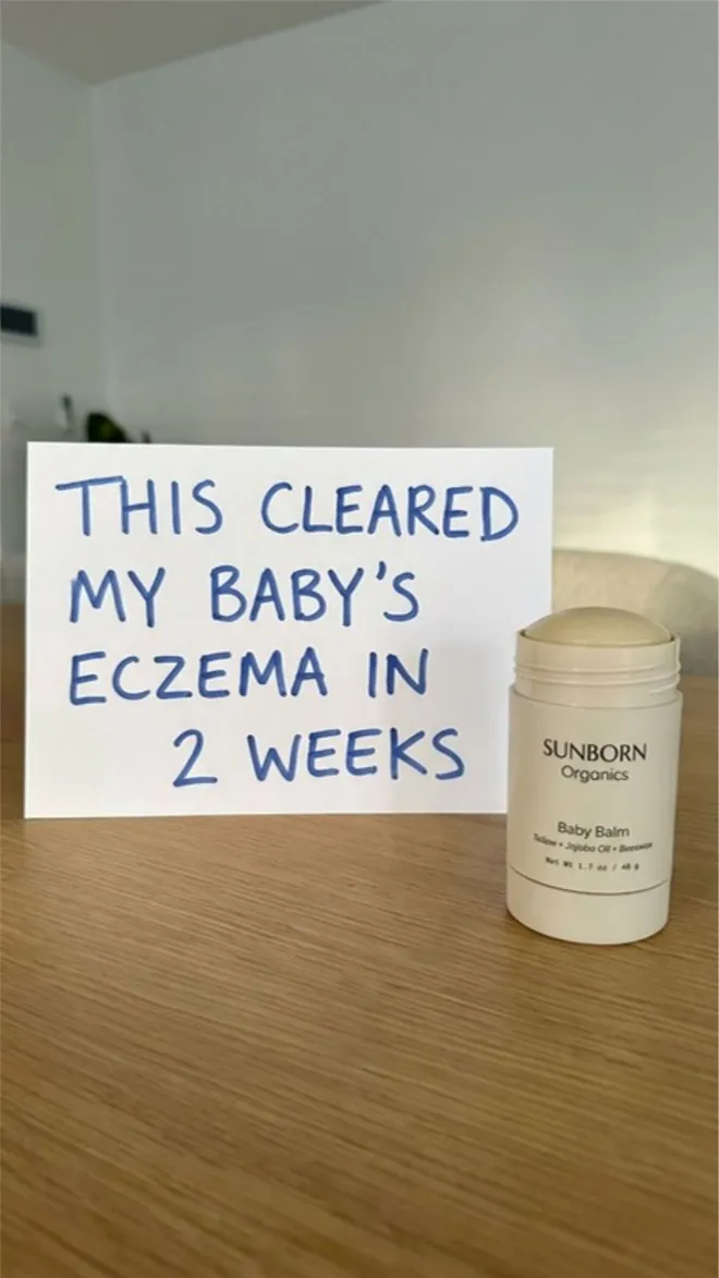
Sunborn Organics ad with a handwritten sign: this cleared my baby's eczema in 2 weeks
Sunborn Organics. A handwritten note propped next to the product. It looks homemade, which is exactly why it gets a second look.
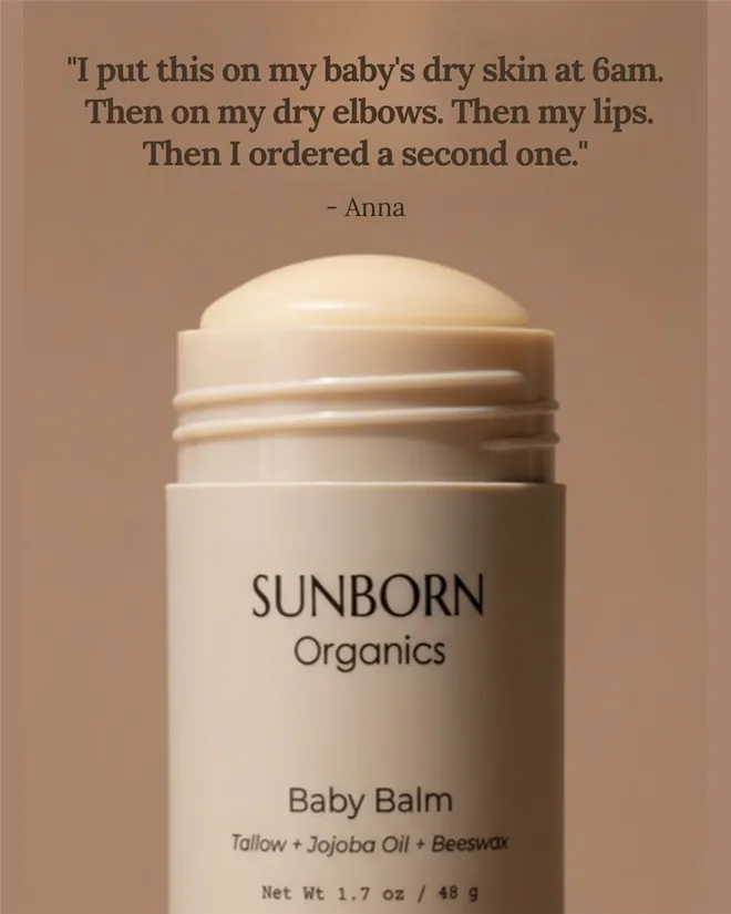
Sunborn Organics ad with a customer quote above the baby balm stick
Sunborn Organics. A customer quote with a story in it: one product, three uses, then a second order. The last line is the proof.
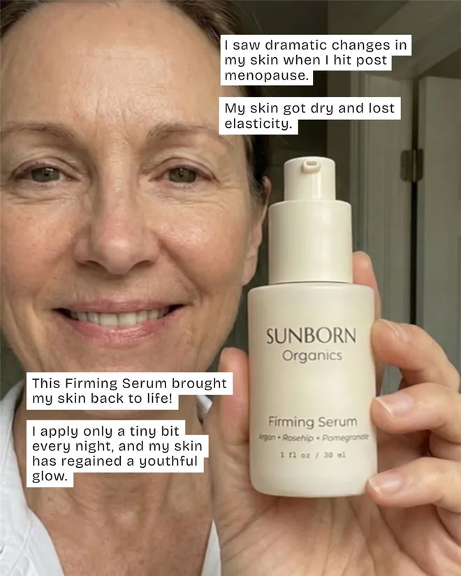
Sunborn Organics ad of a customer holding the firming serum, with the review in caption bubbles
Sunborn Organics. A face, the product held up to the camera, and the story told in caption bubbles. The job of a UGC video, done in one image.

5. Pattern interrupts

The feed is a wall of polish. Anything that breaks it gets a second look, as long as the headline ties it back to the product.
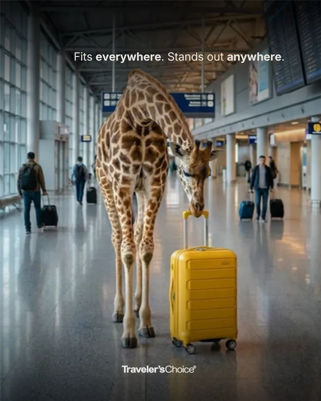
Traveler's Choice ad of a giraffe in an airport beside a yellow carry-on
Traveler's Choice. A giraffe in an airport stops the thumb. The headline pays it off: fits everywhere, stands out anywhere.
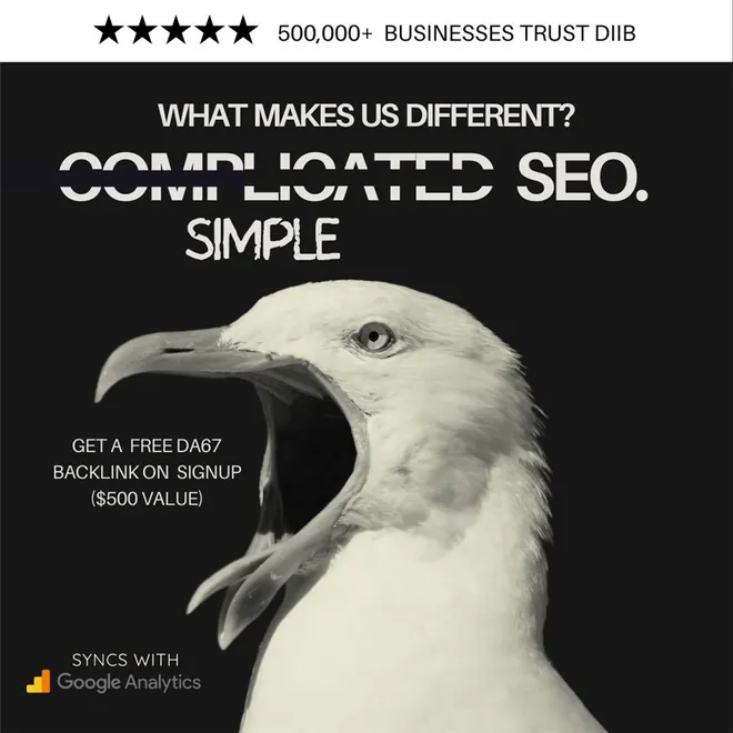
Diib ad of a screaming seagull with the line complicated SEO, simple
Diib. A screaming seagull is how SEO feels to a small business owner. The crossed-out word says the rest.

6. Problem first

Name the problem so precisely the viewer feels caught. The product shows up as the answer.
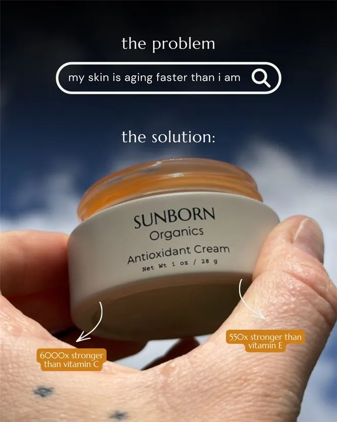
Sunborn Organics ad with the problem typed into a search bar and the cream as the solution
Sunborn Organics. The problem is typed into a search bar, in the customer's own words. Plenty of the people seeing it have typed something similar.
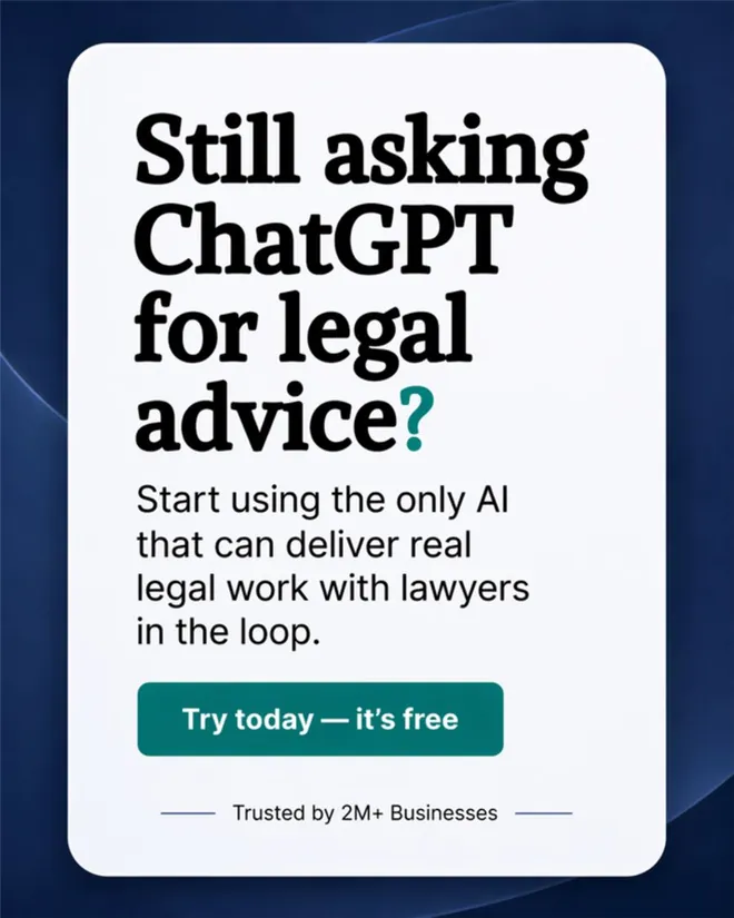
Inhouse AI ad asking: still asking ChatGPT for legal advice?
Inhouse AI. Calls out what the reader is doing right now. The question lands because so many of them are.

7. A new buyer for the same product

Sometimes the new angle isn't a new message. It's a new person with a different reason to buy.
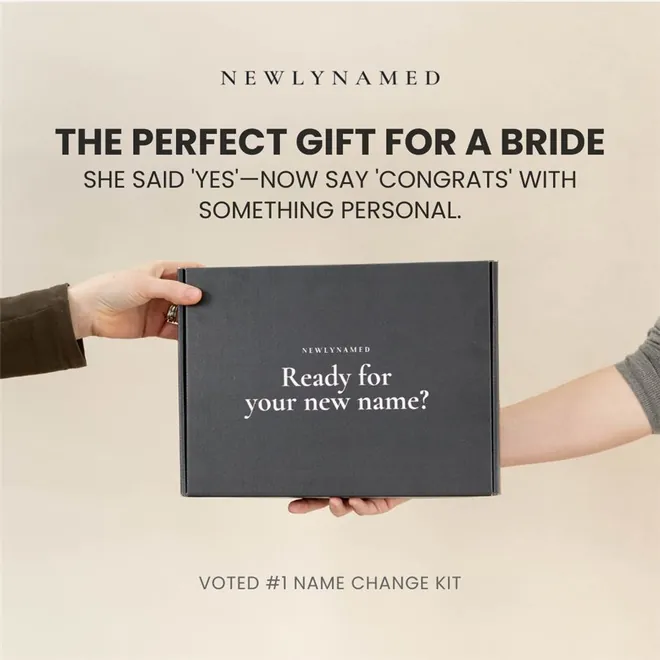
NewlyNamed ad pitching the name change kit as the perfect gift for a bride
NewlyNamed. The same name change kit, sold to someone new: the bride's friend, looking for a gift. New angle, new audience, same product.

8. Offers and reminders

Discounts and reminders work best on people who already know you. Lead with the offer, and make the number real.
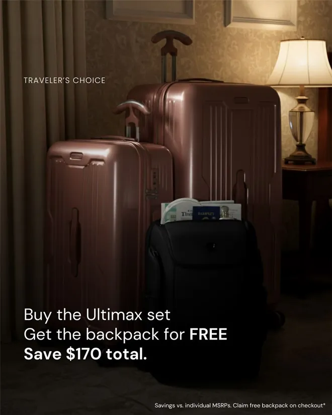
Traveler's Choice ad: buy the Ultimax set, get the backpack free, save $170
Traveler's Choice. The offer is the headline, and the saving is a real number. Best shown to people who already know the brand.
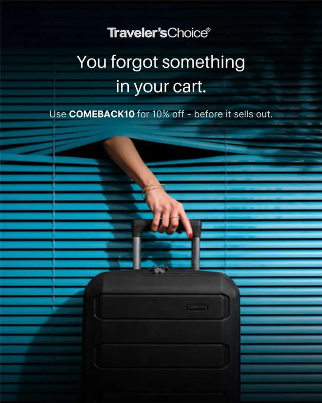
Traveler's Choice cart reminder ad with a hand reaching through window blinds for a suitcase
Traveler's Choice. For people who left something in their cart. The hand sneaking in through the blinds turns a reminder into a small heist.

The one-glance test

Look back over all twenty and you'll notice one thing they share. You get the point in a single glance.

That's the check I run on every static before it goes live. I call it the one-glance test: cover the caption, look at the ad for one second, and say what it's selling and why you'd care. If you can't, the ad isn't finished.

The feed gives you one glance. Design for it.

How to make your own

1. Start from what customers say. Reviews, comments and support emails are full of angles, often in words you can use as they are.

2. Pick the format after the angle. Decide what the ad argues first. Then choose the format that makes that argument fastest.

3. Make several at once. One angle, three formats, two headlines each. Meta now rewards variety, and I explain why in Meta Andromeda, explained.

4. Brief it properly. A one-page brief keeps the designer, the creator and the media buyer pointed at the same idea. Mine is the creative brief template.

5. Let the numbers pick the winners. Judge statics on click-through rate first, then cost per result. How I run the tests is in creative testing on Meta.

The words that go with the image are in how to write Facebook ad copy. Sizes, safe zones and the static format itself are covered in what is a static ad. The rest of my work lives in the creative vault.

Pool rule 003Be prolific. Volume finds winners.

Quick answers

What makes a good Facebook ad? One clear point, understood in one glance, aimed at a specific person, with proof that it's true.

Where can I see other brands' Facebook ads? In the Meta Ad Library, which shows the ads currently running on Facebook and Instagram, searchable by brand. An ad that has been running for months is usually earning its keep.

Can Facebook ads have text on the image? Yes. Meta dropped its old 20% text rule years ago, though it still suggests keeping text light. Keep it to the one line that matters.

What size should a Facebook ad image be? 4:5 for feed, which Meta's Ads Guide now puts at 1440 × 1800 pixels, or 1:1. Use 9:16 for Stories and Reels.

How many ads should I run? More than most accounts do: several new concepts a week, not a handful a month. Why is in you have a creative volume problem.

The one-line version

Great Facebook ads aren't clever. They're clear in one glance, about one thing someone already cares about.